
Text and fonts
LineaForge text is live vector lettering. You type it on the canvas, style it in the Text panel, and the app outlines it with the real font so it draws, exports and cuts exactly as it looks. A text object stays editable (its words, font and layout can all be changed later) until you convert it to plain paths.
Creating text with the Text tool
- Press T or click Text in the tool rail on the left.
- Click where the text should start. An inline editor opens at that point and the tool switches back to Select.
- Type. The text object is created on your first keystroke and re-outlines as you type, so you see the real glyphs on the canvas.
- Press Enter for a new line. Multi-line text is one object.
- Press Escape, press Cmd/Ctrl+Enter, or click anywhere else to finish.
If you finish without typing anything, no object is created. Editing an existing text down to nothing deletes it.
New text uses the default size of 96 px (about 1 in) and Helvetica when it is installed, otherwise the first font on the machine. Change both in the Text panel afterwards.
Editing the words of existing text
- Double-click a text object with any tool to reopen the inline editor.
- Or right-click it and choose Edit text.
The same keys apply: Enter adds a line, Escape or Cmd/Ctrl+Enter finishes. Every edit is one undo step (Cmd/Ctrl+Z).
The Text panel
Select a text object and the Text panel appears at the top of the right-hand sidebar. Every change re-runs the layout immediately and records an undo step.
Font
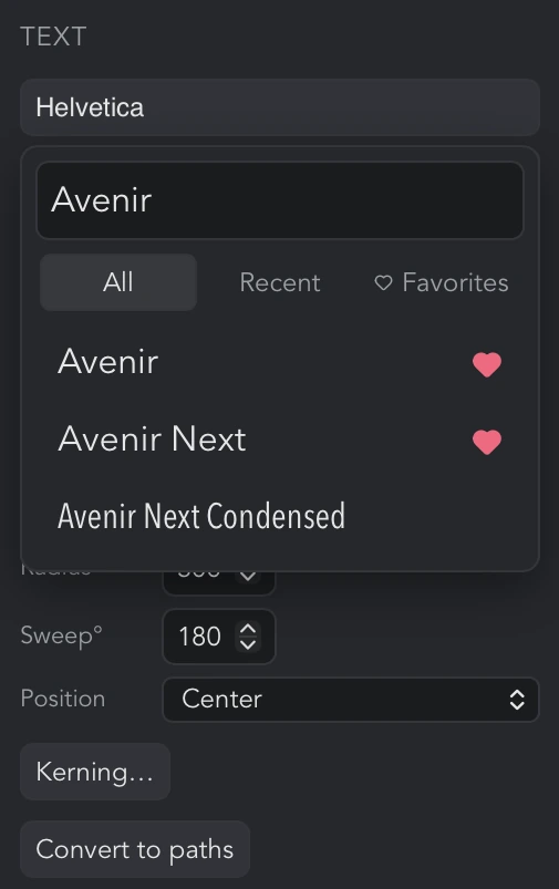
- The font button shows the current family, drawn in that font. Click it to open the picker, type in Filter fonts… to narrow the list, and click a family to use it. Rows are drawn in their own typeface as they scroll into view; the list reads No matches when the filter finds nothing.
- Under the filter, three tabs choose which fonts are listed. All is every installed and added font. Recent is the last 20 fonts you picked, newest first. Favorites is the fonts you have marked with the heart. The font currently in use is always kept in the list, whichever tab is showing, and the tab you were on is remembered.
- Every row has a heart at its right edge (faint until you point at the row). Click it to add that font to your favorites, or click a filled heart to take the font out again; the picker stays open. Favorites are listed in the order you added them.
- Recent and favorite fonts are yours, not the document's: they are remembered on this computer and are the same in every file you open. A font you add from Google Fonts goes to the top of Recent as soon as it is added.
- Google Fonts… opens the Google Fonts window.
- Style lists the faces the family provides, for example Regular, Bold, Italic, Bold Italic. Only faces that actually exist on the machine (or were downloaded) are offered.
Size and spacing
- Size is the font size in document pixels (96 px = 1 in). The minimum is 1.
- Tracking adds the same space after every character, in thousandths of the font size (per-mille em). Negative values tighten the run. The tooltip reads "Letter-spacing for the whole run (per-mille em)".
- Leading is the line height in pixels for multi-line text. Leave it blank for auto, which is 1.2 times the size.
Align
For straight text with more than one line, the Align left, Align center and Align right buttons set how the lines sit against each other. The buttons are hidden for arc and on-a-path text, which is a single run along its baseline.
Shape: straight, arc, or on a path
The Shape menu chooses the baseline:
- Straight is ordinary text.
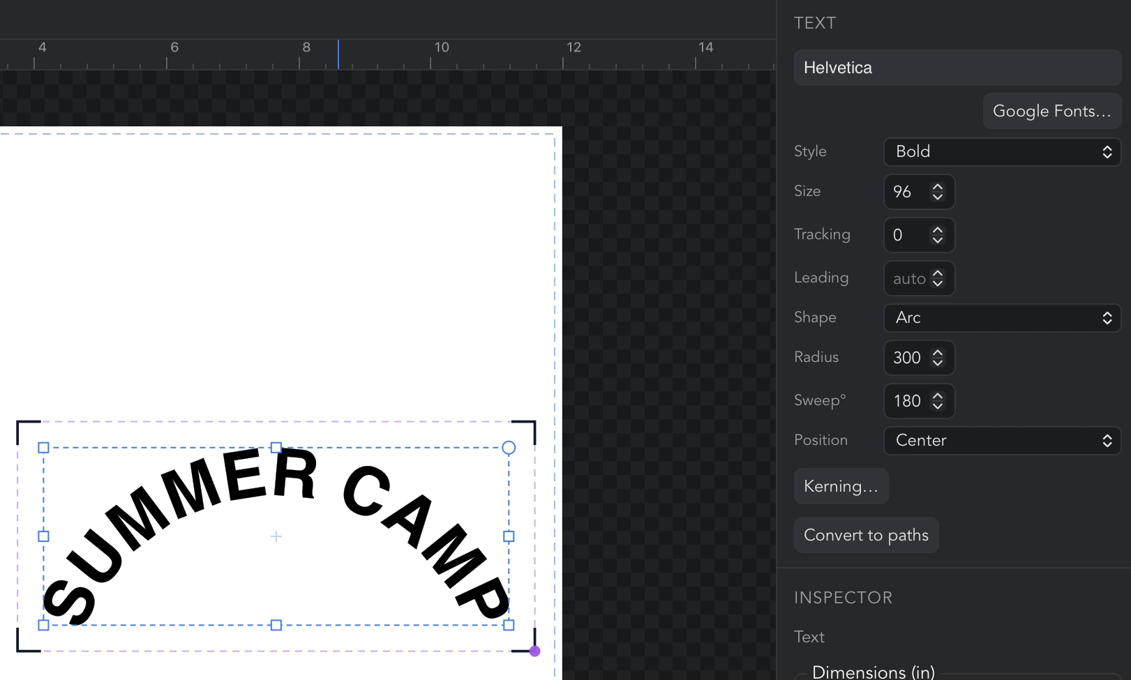
- Arc bends the text around a circle. Radius is the circle's radius in pixels and Sweep° is how many degrees of the circle the text occupies (1 to 360). The panel remembers your radius and sweep, so switching to Straight and back restores them.
- On a path lays the text along any path in the document. See the next section.
For Arc and On a path a Position menu appears: Start, Center or End places the run at the beginning, the middle or the end of its baseline.
Text on a path
- Select the text and choose On a path under Shape.
- The panel shows Click a path on the canvas…. Click any other object; its path becomes the baseline.
- To change the baseline later, click Pick baseline path and click another object.
The baseline is a snapshot of the object's shape taken when you click it: the object you clicked is not changed or attached, and moving it afterwards does not move the text. Pick it again if you want the text to follow a new position. You cannot pick the text object itself.
Kerning
Click Kerning… to adjust the space after individual characters. When adjustments are set, the button shows how many, for example Kerning… (3).
The Kerning window floats over the canvas and can be dragged by its title bar so it is not covering the text you are adjusting. It shows one cell per character: the glyph on top and a number underneath. The number is extra space after that character in thousandths of the font size; negative pulls the next character closer. Spaces are shown as ␣, and multi-line text gets one numbered row per line. The title reads Kerning: N adjusted once anything is set.
- Reset all clears every adjustment.
- Kerning works on straight, arc and on-a-path text alike.
- Tracking, in the Text panel, shifts every character at once; kerning is for one gap at a time.
Convert to paths
Convert to paths (also in the right-click menu) turns the text into ordinary vector paths. After that:
- The Text panel no longer appears for it and the words cannot be re-edited.
- The outlines are node-editable with Edit nodes (N).
- The font is no longer needed to open the file on another computer.
Convert a copy if you may want to change the wording later.
How text is cut or drawn
A text object stores its words, font and settings alongside an outline built by the native font engine. The canvas, every export (SVG, PDF, DXF, EPS, PNG and so on) and the cutter or plotter all use that outline, so what you cut is exactly what you see, with no text-to-outline step to remember.
Useful follow-ups that work directly on text objects:
- Break apart (right-click menu) splits a word into one object per letter, with each letter keeping its own counters (the hole in an "o" stays with the "o").
- Union, in the Boolean flyout of the tool rail, welds overlapping letters, which is what you want before cutting a script font where the letters touch. Select the text alone and press it (the tooltip reads "Weld overlapping outlines within this object"); if nothing overlaps, nothing is changed.
- For anything that needs plain, node-editable geometry, use Convert to paths first.
Installed system fonts
The font picker lists every font family installed on the computer, plus any Google Fonts you have added. Faces (weights and italics) come from the installed files, so a family that is installed only as Regular offers only Regular under Style.
Install a font with the operating system in the usual way and restart LineaForge to see it.
The Fonts menu
The Fonts button on the top toolbar opens a menu of your favorite fonts (tooltip "Favorite fonts, and the Google Fonts browser"). Each is drawn in its own typeface, with a filled heart at the right edge that removes it from the favorites. With a text object selected, clicking a favorite applies that family to it, exactly as picking it in the Text panel would, and records an undo step; with nothing selected, or something that is not text, the rows are greyed out and the tooltip reads "Select a text object to apply this font". Until you have marked any favorites the menu says so and points you to the heart in the font picker.
Google Fonts…, at the bottom of the menu, opens the Google Fonts window.
The Google Fonts window
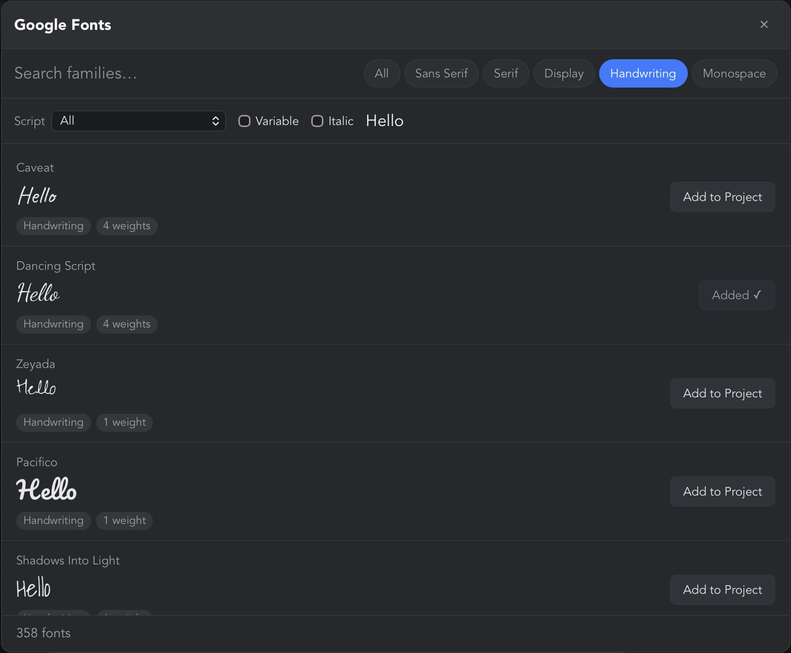
Open it with Google Fonts…, either at the bottom of the Fonts menu on the top toolbar or under the font picker in the Text panel. The window is titled Google Fonts and lists the Google Fonts catalog, most popular first.
Browsing and searching
- Search families… filters by name as you type.
- The category chips narrow the list: All, Sans Serif, Serif, Display, Handwriting, Monospace.
- Script limits the list to families that cover a writing system (for example latin, cyrillic, greek).
- Variable shows only variable fonts; Italic shows only families that include an italic.
- Preview text… sets the sample each row is drawn with. If a text object was selected when you opened the window, its first line is used automatically.
Each row shows the family name, a preview in the real font, and tags for its category, how many weights it has, and whether it offers Italic or is Variable. The footer counts the matches; the list shows at most the first 400, so narrow a long result with search or the chips.
Previews are fetched from Google as rows scroll into view. With no internet connection the preview falls back to the interface font; the names and tags still work.
Adding a font to the project
Click Add to Project on a row. The button reads Adding… while the family downloads and Added ✓ when it is done. Every weight and italic of the family is downloaded, so all of its faces appear under Style in the Text panel straight away. There is no operating-system install, no administrator prompt and no restart.
Adding a font needs an internet connection; it downloads the font files directly from Google's font servers. If a download fails, the window says which family and why, and any faces that did download are still usable.
Where downloaded fonts live
Added fonts are stored in LineaForge's own data folder on this computer, in a fonts subfolder (on macOS, under ~/Library/Application Support/com.rabidsample.lineaforge/fonts). They are registered again every time the app starts, so they are available in every document on this machine.
They are not embedded in the document file. To open a design that uses an added font on another computer, add the same font there, or convert the text to paths before sharing it.
The catalog, the snapshot and working offline
The list of families comes from three sources, best first:
- A live list from Google, refreshed at most once a day and cached on disk.
- The last list this computer downloaded, if Google cannot be reached.
- A catalog of around 1,950 families built into the app itself.
A banner at the top of the window tells you which one you are looking at. "Couldn't reach Google Fonts, so this is the list included with this build" means you are offline or Google is unreachable; "This build has no Google Fonts API key" means this copy of LineaForge cannot refresh the list at all. In both cases Add to Project still works whenever you have a connection, because downloading a font never needs the key; only refreshing the list does.
Curving a word around a circle
- Create the text and select it.
- Under Shape choose Arc.
- Set Radius to the circle's radius in pixels (96 px = 1 in) and Sweep° to how much of the circle the word should cover: 180 for a half circle, 360 for a full ring.
- Use Position to put the word at the Start, Center or End of that arc.
- Open Kerning… if a pair of letters sits too close or too far apart on the curve.
For a word that follows a drawn shape rather than a circle, draw the shape with the Pen or a shape tool first, then choose On a path and click it.
Welding script lettering for a single cut
Script and brush fonts overlap from letter to letter, and a cutter would otherwise cut every overlap as its own line.
- Create the text and set its font, size and tracking.
- Adjust Kerning… until the joins look right; kerning is still live at this point.
- With only the text selected, open the Boolean flyout in the tool rail and press Union. The overlapping contours become one outline. Letters that did not overlap are left as they were.
Do the kerning before the union: once the letters are welded, the object is plain paths and the Text panel no longer applies.
Using a Google font in a design
- Click Fonts on the top toolbar, then Google Fonts….
- Search or filter for the family and click Add to Project. Wait for Added ✓.
- Close the window. In the Text panel, open the font picker: the new font is at the top of its Recent tab. Pick it, and click its heart if you will want it again.
- Choose a weight or italic under Style.
The font stays available in every document on this computer. If the design will be opened elsewhere, Convert to paths before sharing it.
Keys and shortcuts for text
- T selects the Text tool.
- Enter inserts a new line while editing.
- Escape or Cmd/Ctrl+Enter finishes editing. Clicking elsewhere also finishes.
- Double-click a text object to edit its words.
- Cmd/Ctrl+Z undoes the last edit or panel change.
- N switches to Edit nodes, for text that has been converted to paths.
- In the number fields, the up and down arrow keys step Tracking and kerning values by 5, Radius by 10, Sweep° by 5 and Size by 1.
Troubleshooting
- A font in the picker shows in the wrong typeface or as a plain fallback. The row is drawn once the font has loaded; scroll it into view again or wait a moment. The canvas always uses the real font.
- The Style menu offers only Regular. The family has no other faces installed. For a Google font, add it again from the Google Fonts window to fetch every weight.
- A shared file shows different lettering. The other computer is missing the font. Either add it there or Convert to paths before sending.