
Images, vectorize and Image Path
LineaForge can place a bitmap picture on the canvas, crop it, trace its edges into cuttable vector paths with Vectorize, or redraw its tones as pen patterns with Image Path. Pictures are embedded in the document, so a saved project carries them with it.
Placing an image
Choose File → Import → Image… and pick a file, or use File → Open… (Cmd/Ctrl+O), whose All supported filter also accepts images. Supported formats are PNG, JPEG, GIF, BMP and WebP.
The picture is placed at the top-left of the artboard at its natural pixel size: one image pixel becomes one document pixel, and 96 px is 1 in. A 1200 px wide photo therefore lands 12.5 in wide. It arrives selected, so you can scale it with the handles or type a size in the Inspector straight away. Click anywhere on an image to select it; move, resize and rotate it like any other object.
Importing an image adds it to the open document. SVG and DXF files open in a tab of their own instead.
Auto-tracing cutouts on import
An image on a transparent background (a PNG, WebP or GIF cutout) already describes its own silhouette, so LineaForge can trace it as the picture comes in. The result is a single object: the bitmap clipped to its outline, with that outline as a cut line, ready for print-and-cut.
This is controlled by Trace cut lines on imported cutouts in Preferences, which is on by default. With it on:
- Only images that really have a transparent background are traced. JPEGs, BMPs and opaque pictures are placed as plain rectangles of bitmap.
- Holes in the artwork stay holes; the blade follows every edge of the transparency, inside and out.
- If the trace fails for any reason the picture is still placed, just without the cut line.
Turn the preference off if you want cutouts placed as plain images, for example to vectorize them yourself with more control. To get a cut line with a margin around the artwork, use the Vectorize dialog's Outline (cut line) mode with a Trace offset instead.
Cropping with the Crop tool
The Crop tool trims objects to a rectangle. Its tooltip reads "Crop (marquee the area to keep, then press Enter)" and the shortcut is F.
- Press F and drag a box over the area to keep. The box snaps like a shape; hold Shift for a square.
- Everything outside the box is dimmed. Drag inside the box to move it, or drag a corner or edge handle to resize it. Pressing anywhere outside starts a fresh box.
- Press Enter to apply, or Escape to abandon the box.
While a box is on screen the floating Crop panel shows its X, Y, W and H in the document unit, so you can type exact numbers. The panel can be dragged by its title bar out of the way, and its Apply (Enter) and Cancel (Esc) buttons do the same as the keys.
The crop applies to the selected objects, or to everything the box overlaps when nothing is selected. Closed shapes are cut properly rather than masked, open paths are clipped to the box, objects the box does not touch are left alone, and the trimmed objects become the selection afterwards. An image cropped this way shows only the part inside the box.
Cropping an image to a shape
To crop a photo to any outline rather than a rectangle:
- Place the image and draw a shape over the part you want to keep. Any shape works, including a star, a ring or a traced logo.
- Select both the image and the shape, right-click, and choose Crop image to shape.
The result is one object: the shape's outline with the photo showing only inside it. That outline is a real cut line, so it plots, and it keeps the stroke the shape had. The command appears only when exactly one image and one non-image object are selected.
To undo the crop later, right-click the cropped image and choose Release crop. The picture and the shape come back as separate objects exactly where they were, both selected, so you can nudge one against the other and crop again.
Vectorize: tracing an image into paths
Click Vectorize on the top toolbar (tooltip "Vectorize image") to open the Vectorize image dialog. It traces the edges in a raster image into editable vector paths. The preview updates as you change settings, and nothing is inserted until you click Insert.
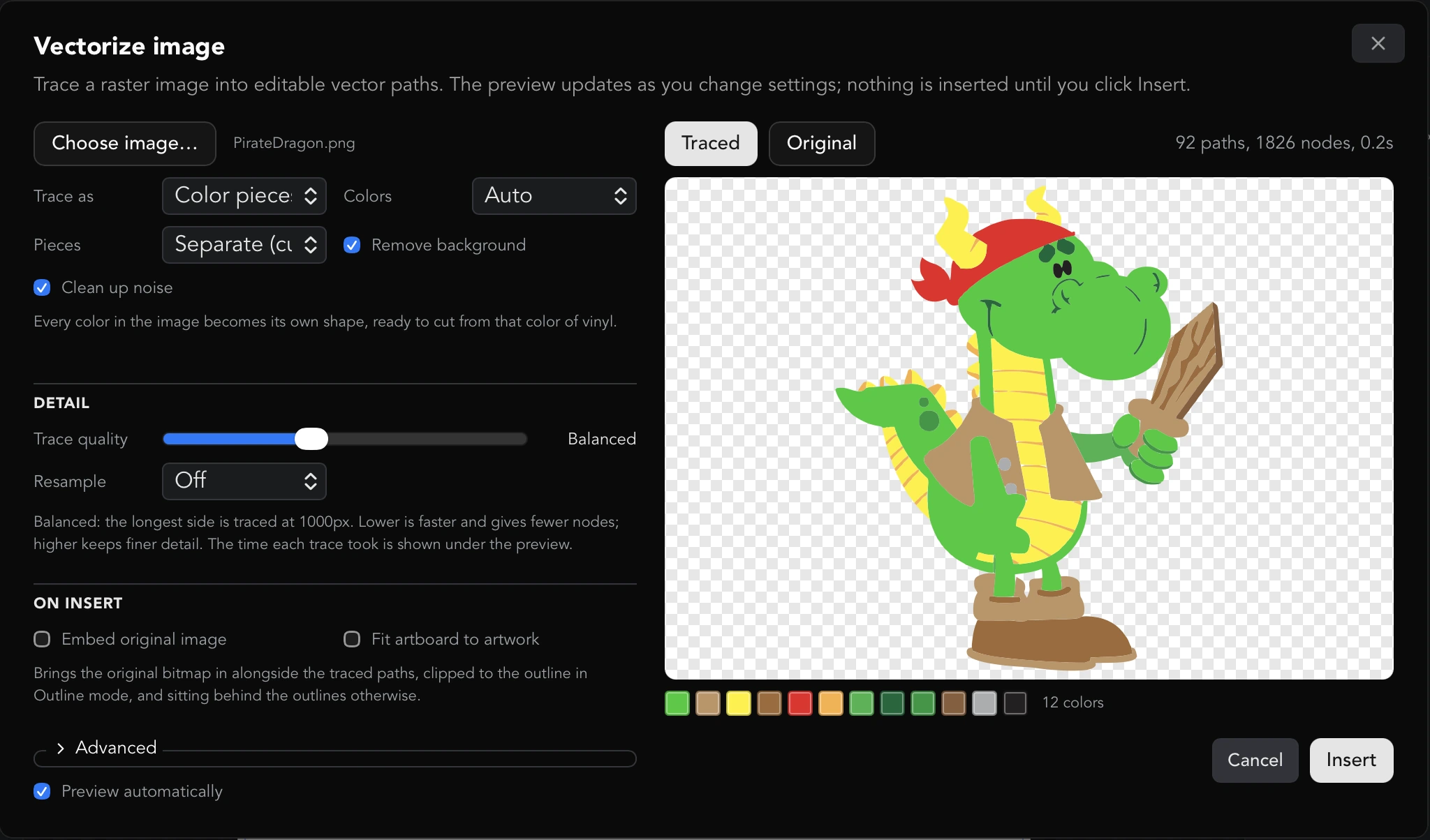
Choosing the image
Click Choose image… and pick a PNG, JPEG or BMP file. The file name appears beside the button and the first trace starts on its own. The dialog also checks whether the file has a transparent background, which decides what Outline (cut line) follows.
Trace as
- Color pieces makes every color in the image its own shape, ready to cut from that color of vinyl.
- Black & white reduces the image to black and white and traces the black. Use it for line art, stamps and single-color designs.
- Outline (cut line) gives one outline around the subject: a cut line for a print-and-cut sticker. It follows the edge of a transparent background when the file has one, and the edge against a white background otherwise. For an off-white background, adjust White tolerance under Advanced.
Color settings (Color pieces only)
- Colors is how many colors the image is reduced to before tracing. Auto finds the distinct colors in the image itself; choose a number (2 to 32) when you know how many colors of material you will cut. The colors the trace settled on are shown as swatches under the preview, with a count.
- Pieces chooses how the colors fit together. Separate (cut apart) makes each color one solid piece with holes where the other colors sit, so the pieces cut apart and fit back together, which suits an inlay or mosaic. Layered (overlapping) keeps each color whole with the ones above painted over it, which suits layered vinyl because the color underneath continuing past the edge hides a slightly misaligned layup. Separate takes several times as long as Layered.
- Remove background finds the background around the subject and drops it instead of returning it as a shape. White enclosed by the artwork, such as an eye or a highlight, is kept. Switch it off to trace a white region as artwork in its own right.
Clean up noise
Clean up noise (Color pieces and Black & white) smooths away JPEG artifacts and stray pixels before tracing so they do not become tiny shapes. It is on by default. Turn it off for pixel art, where every pixel is meant.
Trace offset (Outline only)
Trace offset grows or shrinks the outline, in pixels of the source image. Positive puts the cut line outside the artwork, the margin a sticker or decal wants; negative pulls it inside. The hint line tells you roughly what the figure is in inches. Pieces that grow into each other merge into one outline, so lettering comes back as a single cut line rather than one around each letter. A negative offset splits a shape wherever it is narrower than twice the offset, and an outward offset stops at the edge of the image.
Detail: Trace quality
The Trace quality slider has six steps: Draft, Fast, Balanced, High, Very high and Full. It caps the longest side the tracer works at (400, 650, 1000, 1600 or 2400 px; Full uses the image's own resolution). Lower is faster and gives fewer nodes; higher keeps finer detail. Full is the most faithful and by far the slowest: on a large, busy image it can take tens of seconds and produce more nodes than are practical to edit or cut, so try a step down first. The time each trace took is shown under the preview.
Resample (Off, 1.5×, 2×, 3× or 4×) enlarges the image before it is traced. The edges in a bitmap are anti-aliased, and the in-between pixels along each one record where the edge really crossed, to a fraction of a pixel. Tracing the image at its own size snaps every pixel whole and loses that, so the outline the curves are fitted to is a staircase; enlarging first puts the cut through the ramp where the edge was, so curves come out smoother and corners truer, most visibly on small or soft-edged artwork. It applies after the quality cap and costs the square of the factor in time: 2× is four times as slow, 4× sixteen. The enlarged image is held to 6000 px on its longest side, so on a large image at a high quality step a 4× setting is quietly reduced; the hint line says what the tracer will actually work at. Resampling does not add detail the image does not have. For that, raise the trace quality. Speckle filtering, accuracy, simplify and the trace offset all still mean what they say in source pixels.
On insert
- Embed original image brings the bitmap in alongside the traced paths. In Outline mode this produces a single object: the picture clipped to the traced silhouette, with the outline as its cut line (right-click Break apart later to split it into one clipped image per contour). In the other modes the picture is placed behind the traced paths, locked, with the paths drawn as black outlines over it, and everything grouped.
- Fit artboard to artwork resizes the artboard to exactly hold what was traced. A trace arrives at one document pixel per source pixel, so a large image lands far bigger than a 12 in mat; this moves the page to the artwork rather than resizing the artwork, which would change the size it cuts at.
Advanced
Click Advanced to show the curve-fitting controls:
- Curves chooses how outlines are fitted. Spline fits smooth curves within the Accuracy setting and uses the fewest nodes; Polygon uses straight segments; Pixel keeps every pixel step, which is right for pixel art and nothing else.
- Filter speckle throws away patches smaller than this many pixels across (0 to 16). Raise it to clear scanning noise and stray dots.
- Corner angle is how sharp a turn must be to survive as a corner (0 to 180). Lower rounds more of the outline into curves; higher keeps more hard angles.
- Accuracy (px) is how far a Spline curve may sit from the traced edge, in source pixels (0.1 to 20, default 0.5). Lower is more faithful with more nodes; higher is smoother and lighter. Corners stay sharp either way.
- White tolerance (0 to 255) is how light a pixel must be to count as background. It appears for Outline on a white background and for Color pieces with Remove background on. Lower it to catch cream and off-white grounds; too low and it starts eating the artwork.
- Simplify (px) reduces the node count, letting the outline move by up to this many pixels. 0 keeps every node.
- Smooth curves re-fits curves through the nodes that Simplify keeps instead of joining them with straight lines. Available once Simplify is above 0.
- Blackout ignores each shape's interior holes, so a ring traces as a solid disc. Use it for a cut line around artwork where the hole is material you are keeping.
Point at any control, or tab to it, and the line under its group describes what it does with your current value.
The preview
- The preview re-traces on its own about a third of a second after you stop changing a setting. The previous result stays visible, dimmed, until the new one arrives, and the status line reads "settings changed" while it is out of date.
- The Traced and Original buttons flip between the result and the source image in the same frame. The traced view sits on a checkerboard so anything removed reads as transparent.
- The status line shows the number of paths and nodes and how long the trace took. A running seconds counter shows while a trace is in progress.
- Preview automatically can be switched off for a very large image at high quality. A Trace button (later Re-trace) then appears and the preview only updates when you click it.
- Stop waiting appears while a trace runs. It gives you the dialog back straight away; the trace itself cannot be stopped once started, so it finishes in the background and its result is discarded.
- If a result carries an unusually large amount of geometry (around 40,000 nodes or more) the dialog warns that the canvas will feel heavy and a cut will take a long time, and suggests dropping the quality a step or raising Simplify.
Inserting
Click Insert. The traced objects are added to the document, selected, and brought into view (or the artboard is fitted around them if you ticked Fit artboard to artwork). Cancel closes the dialog without inserting anything.
Image Path: drawing an image as pen patterns
Click Image Path on the top toolbar (tooltip "Image Path: draw an image as pen patterns") to open the Image Path from image dialog. Where Vectorize follows the edges in a picture, Image Path follows its tone: more ink where the image is dark, none where it is light, using strokes only. The result is something a plotter, engraver or a blade's drawing tool can follow. Nothing is filled except in Vexel's flat-color fill.
The dialog shares the Vectorize layout: Choose image… (PNG, JPEG or BMP), a Pattern menu grouped into Stamps, Lines, Dots and Layers, controls for that pattern, Tone and On insert groups, an Advanced section, the Preview automatically checkbox with a Generate / Regenerate button when it is off, and a preview with Result and Original buttons. The status line shows strokes, nodes and the time the run took. Point at any control for a description that includes your current value.
Every size is in pixels of the source image, which is the scale the result arrives at (96 px = 1 in); the hint lines give the figure in inches.
Shapes
A stamp repeated across the image and sized by how dark it is underneath: bigger where the picture is dark, vanishing where it is light.
- Stamp: Circles, Squares, Diamonds, Triangles, Hexagons, Stars, Crosses, Text… or Selected objects.
- Text… shows a Text field and a Font menu. Each cell gets the next character of the text in reading order, scaled by the tone under it; spaces are skipped. A single letter repeats; a word spells itself out across the rows. Heavy faces read best at small sizes. Any installed or added font can be used.
- Selected objects stamps with whatever was selected on the canvas when the dialog opened: a logo, a shape, a converted text object. Select the objects first, then open Image Path; the menu entry shows how many it captured, for example Selected objects (2), and cycles through them. A group counts as one stamp.
- Layout: Quadtree (follows detail) splits the image into cells wherever the tone varies, so flat areas get a few large stamps and detailed areas many small ones (the look of a portrait made of circles). Grid places stamps on a regular lattice like a printed halftone screen. Scatter (follows tone) puts one stamp on each dot of the stipple scatter, so the stamps crowd together where the image is dark and the spacing carries the tone as well as the size.
- For Quadtree: Smallest cell (px) is the smallest cell it splits down to, Largest cell (px) the largest it starts from (flat areas stay this size), and Detail (0 to 1) how much the tone may vary inside a cell before it is split; lower splits more readily.
- For Grid: Cell size (px) is the lattice pitch and Angle (-90 to 90) turns the lattice and the stamps on it; 45° is the classic halftone screen. Jitter (0 to 1) nudges each stamp off its lattice point by up to that fraction of a cell, at random, which takes the mechanical look off a grid. Interleave rows shifts every other row by half a cell so the stamps interlock like bricks.
- For Scatter: Stamps is how many to scatter, Relax the number of relaxation passes and Arrangement the random seed, as for Stipple dots below.
- Random rotation (0 to 180) turns each stamp by a random amount up to that many degrees either way, for a hand-placed look. 0 keeps them all upright.
- Outlines (1 to 4) draws each stamp that many times, nested, which reads as a heavier line without a thicker pen.
- Coverage (under Advanced, 0.05 to 2) is how much of its cell a stamp fills where the image is fully black. Below 1 leaves a margin between neighbors; above 1 lets them overlap.
Hatching
Families of parallel lines, one more family at a new angle for each step darker, the way a pen-and-ink drawing is shaded.
- Levels (1 to 8) is the number of steps of shading: the darkest areas carry all the families of lines, the lightest none.
- Spacing (px) is the distance between lines. Match it to the pen; closer than its width and the lines merge.
- Angle sets the first family's direction; each further level turns by 180° divided by the number of levels.
Hatching arrives as one path per shading level, grouped.
Line density
One family of parallel lines at one angle, packed by tone: the darkest areas are drawn at the chosen spacing, each step lighter doubles the gap, and the lightest areas stay empty. This is how an engraver shades with one direction of stroke, and the cleanest pattern for a pen because every stroke is straight.
- Levels is the number of density steps; the hint tells you the spacing in the lightest drawn areas.
- Spacing (px) is the gap between lines in the darkest areas.
- Angle: 0° is horizontal, 90° vertical.
Squiggle lines
Horizontal lines that stay straight through the light areas and wobble harder and faster through the dark ones.
- Spacing (px) is the distance between lines.
- Amplitude (px) is how far a line swings from its course where the image is fully black. Half the spacing lets neighbors just touch.
- Frequency (0.1 to 10) is how tightly the lines wobble; 1 gives a wavelength of about one and a half times the spacing in the darkest areas.
- Link ends (one stroke) runs the rows back and forth and joins their ends, so the whole pattern is a single stroke with no pen lifts.
Scribble loops
Horizontal lines that curl into loops where the image is dark, the way a pen is scribbled back and forth to shade, and run straight through the light areas. The pen goes backwards through the top of every loop, which is what makes a dark area read as a dense tangle rather than a wave.
- Spacing (px) is the distance between rows.
- Loop radius (px) is the radius of the loops where the image is fully black. Half the spacing lets the rows just touch; more makes them overlap into a solid.
- Frequency is how many loops the pen makes per spacing of travel in the darkest areas; higher is a tighter scribble.
- Link ends (one stroke) joins the rows into one stroke, as for Squiggle lines.
Spiral
One continuous line spiraling out from the center, wobbling where the image is dark. It is a single stroke, so it plots fast. It uses the same Spacing (px), Amplitude (px) and Frequency controls as Squiggle lines.
Sketch strokes
The look of a pencil sketch. A copy of the picture is drawn *out of*: each stroke starts at the darkest spot left, tries a fan of directions and takes the one that crosses the most darkness, lightens the copy under what it drew, and goes on from the far end until the way ahead gets much lighter than where it started, or the stroke is long enough. Then the pen lifts and the next stroke starts at the new darkest spot. Every stroke follows the structure of the picture because that is where the darkness is.
- Steps in all is the total number of straight steps across every stroke, up to 200,000. The picture is drawn darkest-first, so a small budget is a rough sketch and a large one fills in.
- Step length (px) is the length of one straight run. Shorter follows the picture more closely with more nodes; longer is bolder.
- Longest stroke (steps) is how many steps a stroke may take before the pen lifts.
- Directions tried (2 to 360) is how many directions are tested at each step. More finds darker lines and takes longer. 3, 4 or 6 make the strokes build triangles, squares or hexagons.
- Lightening (0.02 to 1) is how much each stroke lightens the picture under it. Lower means more strokes pile up on an area before it counts as drawn, for denser darks.
- Smooth curves draws each stroke as a smooth curve through its points instead of straight runs.
- Arrangement is the random seed, which decides how the fan of directions is turned at each start.
Flow lines
Evenly spaced lines on a swirling field, close together where the image is dark and far apart where it is light, and never crossing. Pure white gets no lines at all. With Edge power the field bends to follow the contours of the picture, the way hatching follows a form.
- Spacing (px) is the distance between lines in the darkest areas.
- Spread (1 to 20) is how many times further apart the lines are in the lightest areas than in the darkest.
- Swirl size (px) is the size of the swirls the field is made of. Smaller is busier; larger gives long, sweeping curves.
- Turn (0 to 180) is how far the field may bend from Angle, in degrees either way. 180 lets it swirl freely; 0 makes every line run at the angle, so the pattern is a tone-spaced hatching.
- Angle is the direction the field leans to.
- Edge power (0 to 1) is how much the lines follow the picture's contours instead of the field, where it has an edge to follow.
- Arrangement is the random seed: which swirl to generate.
Stipple dots
Dots that crowd together where the image is dark and spread out where it is light. Each dot is a tiny circle for the pen.
- Dots is how many to aim for, up to 20,000. A few thousand is a portrait; a few hundred is a texture.
- Relax (0 to 20) is the number of relaxation passes; each spreads the dots more evenly through the tone. More is smoother and slower; zero leaves the raw, clumpier scatter.
- Dot size (px) is the radius of a dot where the image is fully black. Lighter areas get smaller dots as well as fewer.
- Arrangement is the random seed. The same number always gives the same artwork; the dice button tries another arrangement.
Dashes, Cells, Triangles, Tree and One continuous line
Five more ways of drawing that same scatter of dots. All of them use Dots, Relax and Arrangement as for Stipple dots, and all the tone is carried by where the dots are; what differs is how the pen connects them, and how often it has to lift.
- Dashes draws a short stroke at each dot, longest where the image is dark. Dash length (px) is the length where the image is fully black (a third of that in the lightest areas). Angle is the direction the dashes lean to, and Edge power (0 to 1) how far they turn instead to follow the contours of the picture.
- Cells draws the boundaries between the dots: a Voronoi cell network that is fine where the image is dark and open where it is light. The edges are chained into as few strokes as a walk along them allows. The Voronoi fill pattern in the Inspector is a separate feature and is unchanged.
- Triangles joins each dot to its neighbors: a mesh of triangles, fine where the image is dark and open where it is light. Edges that would cross white are left out, so the background stays empty.
- Tree links the dots by their shortest connections into one branching tree, with no loops and no crossings, every dot reached. The branches are chained into strokes.
- One continuous line visits every dot once with a single stroke, wandering where the image is dark and striding across where it is light: the travelling-salesman drawing, and the pattern that plots with no pen lifts at all. Untangle passes (0 to 10) is how many passes are spent swapping crossing stretches of the line for shorter ones; more is a shorter, cleaner line and slower, 0 keeps the raw nearest-neighbor route. The line is opened at its longest jump so the pen is not sent back across the picture at the end. Twenty thousand dots take about a second.
Vexel (poster layers)
The picture is cut into a few flat layers, the way a screen-printed poster is. Each layer is drawn as its outline plus a fill, with the lightest layer left as the paper.
- Layers (2 to 8) is how many. Three or four is the classic poster; more keeps more of the photo.
- Cut by color reduces the picture to that many colors instead of steps of tone, one layer per color drawn in that color. The field is then labeled Colors. With Prompt for tool change in the Plotter dialog, each color can be plotted with its own pen. Contrast and Follow the light areas do not apply in this mode.
- Lightest layer is the paper leaves the lightest layer undrawn. Switch it off to fill that layer too, for a dark sheet or a picture with no white in it.
- Smoothing (px) softens the picture before it is cut into layers, so the layers come out as bold shapes rather than noise. More is more poster-like; less keeps fine detail.
- Smallest patch (px) absorbs patches smaller than this into the layer around them. Raise it to clean off speckle; lower it to keep small features.
- Fill: Hatching draws parallel lines through each layer, closest together in the darkest layer and four times further apart in the lightest drawn one. Crosshatching adds a second family at right angles. Concentric draws nested insets of each layer's outline, a spacing apart, like a contour map; it is striking, and a lot of geometry to plot. Flat color (filled) draws no lines: each layer becomes a shape filled with the average color of the picture under it, which is vexel art as an image. A pen cannot draw a fill, so use flat color for print-and-cut, or give the shapes a line fill from the Inspector afterwards.
- Spacing (px) (not for flat color) is the distance between lines in the darkest layer; the lighter layers open out from there.
- Angle (Hatching and Crosshatching) is the line direction; crosshatching adds the second family 90° from it.
- Outline each layer draws the boundary of each layer. With a line fill this gives the cut-out look; without it the layers are just areas of hatching. With flat color it strokes the edge of each shape as well as filling it.
Every layer arrives as its own outline and fill objects, grouped, so a layer can be given a different pen afterwards.
Tone
These apply to every pattern:
- Contrast (0.1 to 5) adjusts the tone curve. Above 1 pushes ink harder into the dark areas and clears the light ones; below 1 spreads it more evenly so light areas still get some ink.
- Ignore lighter than (0 to 0.99) is a cut-off in tone: areas lighter than this get nothing, so the pattern stays out of a light background altogether. 0 cuts nothing off. The cut fades in over the Threshold feather band set under Advanced.
- Line width (px) is the stroke width of everything drawn. It affects how the preview looks and the gap between nested outlines; the pen decides the real width. Sketch strokes also lighten a band of this width under them.
- Follow the light areas inverts the picture: ink goes where the image is light instead of dark, for drawing with a white pen on black paper or engraving a negative.
On insert and Advanced
- Fit artboard to artwork resizes the artboard to exactly hold the pattern, as in Vectorize.
- Sample size (px) (Advanced, 64 to 2000) is the size the image is reduced to before its tone is read. Larger reads finer detail and is slower; the pattern's sizes do not change.
- Threshold feather (Advanced, 0 to 1) is how wide a band of tone the Ignore lighter than cut-off fades in over. 0 is a hard edge.
The preview
- The preview regenerates about a third of a second after you stop changing a setting; the old picture stays, dimmed, until the new one arrives.
- Result and Original flip between the pattern and the source photo in the same frame.
- Turn off Preview automatically for a very large image or a very dense pattern and use Generate (later Regenerate) instead.
- A result of around 60,000 nodes or more is flagged as heavy. Wider spacing, a larger smallest cell, fewer steps or a lower Frequency usually gives a very similar picture with a fraction of the nodes.
What Image Path produces
Click Insert and the pattern is added to the document, selected and brought into view. The output is stroked paths with no fill (except Vexel's flat color): one object per pattern however many strokes it has, or several objects grouped together where a pattern has parts (one per level for Hatching, an outline and a fill per layer for Vexel). Give them a pen in the Inspector or in the Plotter dialog like any other path. The small red dots that mark loose ends can be hidden with the button on the top bar if they obscure a pattern with hundreds of intentional open ends.
Printing an image for print-and-cut
A placed or cropped image prints as the picture and cuts along its outline. Place or auto-trace the image, add registration marks, print at actual size, then cut. The details of marks, printers and the cutter's camera are covered under Export and print.